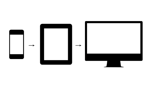
"Mobile First" Demystified
"Mobile first" has become one of the many buzz words that we hear when talking with clients about optimizing their websites for mobile devices. In many cases there is lack of understanding of what it means, what it takes, and the differences with "desktop first." Let us clear the air and explain what all this buzz is really about.


Why is mobile optimization important?
At least a quarter of your audience will be viewing your website on a mobile device. The latest stats indicate that 27.9% of US and 31.5% of global web page views are mobile device views.
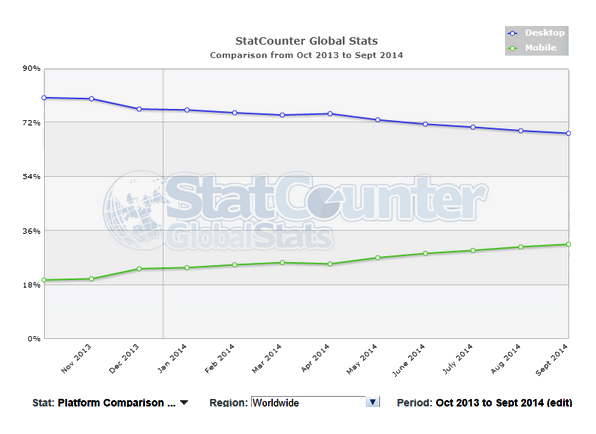
source: gs.statcounter.com/#desktop+mobile-comparison-US-monthly-201310-201409
Users are starting to understand what a good mobile experience is like and take notice when a mobile experience is under par. 61% of people have a better opinion of brands when they offer a good mobile experience. If your site is not optimized for mobile devices, you may be providing a poor mobile use experience, thus negatively affecting your brand.
Differences between desktop and mobile
Let’s explore the differences between desktop and mobile browsing.
- Screen size, screen orientation and pixel density
Screen size is the one obvious difference – mobile devices, particularly smartphones, have such small screens that you cannot just scale the whole website down because it becomes cumbersome to read and navigate.
The fact that most mobile devices are used in portrait orientation, while most desktop devices are used in landscape orientation is another big difference. Most websites have been developed with several columns of content, similar to a newspaper, which doesn't lend itself to a favorable experience on a tall and narrow screen.
Mobile devices have screens with high pixel density or ppi (pixels per inch), which provides better readability for small fonts. The problem is that 10 pixels in your mobile device is significantly smaller (in inches) than the 10 pixels in your desktop screen.
One often overlooked limitation of small screens is that the experience requires more "memory" from the reader; scrolling through a very long page on a small screen makes it hard for the user to remember or register all of the components of a site. Imagine trying to find something in your fridge by looking through a small peephole. As a result, it is very common for mobile users to get lost in long pages.
- Touch screen vs mouse
A touch screen doesn't provide the same precision that a mouse does. With a mouse you can click on a specific pixel in the screen. On touchscreens your finger presses an area and the device has an approximate location of what you intended to click.
For this reason, buttons, links and other clickable elements need to be larger on touch screens. Tasks like image cropping can become very difficult to achieve with high precision in a touch-screen environment.
Besides size and precision, touch screens have different interaction methods: on a touch screen there is no "hover"; with a mouse you can hover over elements before clicking. With a mouse you can only click, hover and drag. Touch screens, on the other hand, have introduced new "gestures" like sliding and pinching with one or multiple fingers. - Flash
You have probably heard this one – mobile devices don't support Flash (or its Microsoft incarnation, Silverlight). It's been over 4 years since Steve Jobs wrote his letter "Thoughts on Flash," part personal vendetta, part business model, part technical considerations, that explains why Apple mobile devices will never support Flash.
Today, the world seems to be abusing Flash much less and avoiding Flash when not needed. Mobile browsers today provide a lot of functionality that was only available by using Flash previously for things like playing videos, animations and game-like interaction.
There are some very specific instances where Flash is still useful, in which case you can use it in your desktop site, but you will not have that functionality on mobile. - Processing power and memory
Computers, including mobile devices, have become so powerful that we normally don't worry about processing power and memory. However, it is good to keep in mind that the most advanced mobile device is only as powerful as a low-end desktop.
This restriction in mobile devices is necessary for space, heat dissipation and battery life considerations, and it is important to keep in mind because extremely large pages, with lots of interaction, images and multimedia will slow down a mobile device. This can be noticeable in the time it takes for a page to render or even simple scrolling. For instance, the now popular "infinite scrolling" pages where more content is loaded to the bottom of the page once you reach it, can easily crash a mobile device. - Bandwidth
Modern mobile devices are capable of connecting at very high speeds, using the latest cellular technologies, or WiFi. However, high performance is not consistent – moving around causes changes in signals that deteriorate the speed of your connection.
It is important to design and build websites conscious of this limitation. This translates into "light" pages that optimize the amount of data that needs to be transferred to the user for it to be useful. - Mobile use case
A “use case” is simply the most common or practical uses for the device.
For instance, a TV is great for watching long movies, but not so much for reading an article. A laptop computer is great for working on a large spreadsheet, but not so much as a portable music player. In the same way, mobile devices are great for some tasks, but very inconvenient for others.
The following chart shows the result of a survey taken in August 2013 in the US, of the share of time spent performing specific tasks or consuming certain types of content by device type.
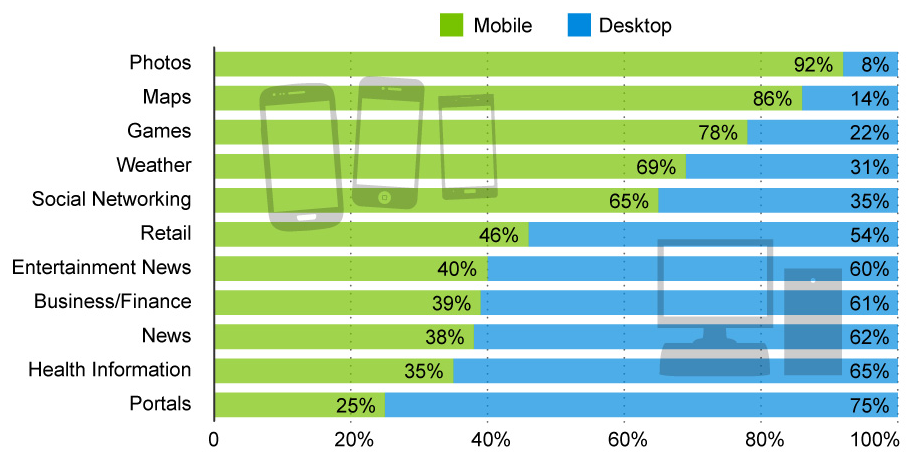
Source: Statista / Mashable / comScore
"Desktop first" or "graceful degradation"
Graceful degradation is the approach of starting design and development from the most feature-rich browser version or largest screen, and scaling it down progressively to function properly in smaller screens or older and less-capable browsers.
As standards and browsers evolve, they provide new functionality and better ways to accomplish the style and interactivity of websites. Developers prefer the latest browser versions and standards because it makes development easier and faster. Unfortunately not all users have the latest browsers, so developers have to accommodate for browsers that don't support the latest features or are non-standard compliant.
In some cases it is impossible (or extremely convoluted) to deliver the exact same style and interactivity of site developed with the latest technologies in old browsers. Ideally even with such gaps the website still provides a functional experience, avoiding a perception of the website being "broken." When smart phones and tablets showed up they presented similar challenges in terms of missing functionality or other limitations (described above).
Obviously there is a limit to how old or non standard a browser or device you can support. In the end, the extent of the degradation is a question that is decided by understanding how many of your users will be affected if you don't support a specific browser, and how much effort is needed to provide such support.
One example pertains to IE6 not supporting transparencies in PNG images, which can affect the style or readability of some websites. If you want to support IE6 you either have to avoid PNG images with transparencies, or make sure the site is still usable and nothing important is hidden behind the PNG images.

PNG transparency support: the image on the left is an example of the support of PNG transparency,
allowing the background and content behind the image to be seen. On the right, is an example
of how the same image may looks in an unsupported browser.
Another case that has to do more with functionality than looks is that many mobile browsers don't support the option to select and upload a file. Because of this limitation, when using Facebook on phones that do not support photo uploads, you can see a message directing users to email their photos instead.
"Mobile first" or "progressive enhancement"
Mobile first, or progressive enhancement, is the opposite approach to graceful degradation. In this case too, you must decide what is the oldest browser or smallest screen you will support. In progressive enhancement you start with the most restrictive device you want to support and build up content, features and styling to work on more modern browsers or larger screens.
Is this the same as responsive design?
No. Responsive design refers to techniques that make website layouts adjust depending on the screen size. This is sometimes used as a synonym to mobile optimization, or mobile first, but in reality they are independent.
Responsive design websites can be created following progressive enhancement or graceful degradation approaches.
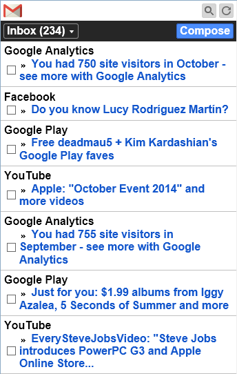
Gmail's Basic HTML version in mobile devices. It's minimal layout and reduced functionality is an example of adapting a website to fit the screen size and device capabilities.
Which approach is better?
In our opinion, neither of the two approaches is fundamentally better. The arguments against one or the other usually point to flaws in the execution and not the approach itself. Executing either requires discipline and attention to detail to avoid having an "afterthought" design for the last device in the process.
In a mobile first approach you start with bare minimum content, design and the functionality that works well in a mobile device, and then build on top of those. In a desktop first approach you start with full features, content and design, and then you scale back. Some people find it easier to add features, others find it easier to remove them.
In most cases, selecting the approach to use in your project boils down to personal, team or client preference. You may also find compeling reasons in your project to start with a specific device. For instance, if in your particular case, the vast majority of your traffic will be coming from a specific device type, you should start with that device first.
To conclude, we want to emphasize that designing and developing websites for various devices is not a simple exercise in adding or subtracting features or content. Taking that route will not yield great results, no matter what end of the device spectrum you decide to tackle first. You must keep the following basic principle in mind: each device has its own nuances and use cases and you should execute a thorough Discovery-Architecture-Design process for each, to ensure a great website experience on all devices.

Ruben Reyes
Technology, Usability & Analytics
Ruben is the lead technologist at Lyquix. He consults directly with clients and manages Lyquix's development team.
Read More