The Mobile Evolution - The Impact of Google's Prioritization of Mobile Sites
On April 21, 2015, Google changed its search algorithm to favor "mobile friendly" websites. We discuss the reasons Google made the change, how it affects your organization, & how you can ensure that your site adheres to the new standards.


2014 - The Tipping Point
In 2005, Mary Meeker, an analyst at Kleiner Perkins Caufield Byers, made the following bold prediction: “Mobile to overtake fixed Internet access by 2014.” It turns out that Mary Meeker was correct. As the chart below illustrates, in 2014, we crossed the tipping point - for the first time, the number of mobile users exceeded the number of desktop users, and the separation between the two is projected to continue to grow.
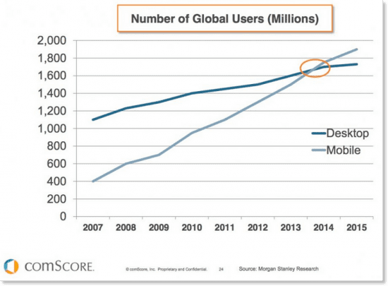
(Source: smartinsights.com)
Mobile crossed other tipping points in 2014:
- For the first time, total mobile activity (mobile app usage + mobile browser usage) surpassed desktop activity. Users now consume approximately 60 percent of their digital media on a mobile device. The remaining 40 percent is consumed through a desktop device. (Source: comScore)
- For the first time, on Thanksgiving Day, traffic from mobile devices outpaced desktop traffic, with 52.1% of all online traffic coming from smartphones and tablets. (Source: IBM)
- Mobile activity will continue to grow. Google search statistics now show that over 50 percent of U.S. searches are done on a mobile device. (Source: Wall Street Journal)
While it is important to recognize that this is the future, and not a fad, we cannot pronounce the desktop dead, nor should we focus exclusively on mobile devices. The message from this change is behavior is clear: users are employing multiple screens throughout the day to access the web.
By neglecting one device or screen, you will be affecting all of the users of your site.
Google Algorithm Change
Each year, Google changes its search algorithm around 500–600 times. While most of these changes are minor, Google occasionally rolls out a "major" algorithmic update (such as Google Panda and Google Penguin) that affects search results in significant ways.
In February of 2015, Google announced it plan to change its search algorithm to favor “mobile friendly” websites. The change took effect on April 21, 2015.
Deemed “mobilegeddon” by observers, the Google algorithm change impacted sites all of sizes, across all industries, and sent shockwaves throughout the web world. Do a quick Google search for “mobilegeddon,” and you will see thousands of news articles and images that accurately depict the major disruption that this changed caused. Fortunately, the world did not end when Google made this change. When we woke up on April 22, 2015, the sun rose in the East and set in the West, and our computers and mobile devices still functioned. But the search results that we relied on to find restaurants, shops, content, and good and services had changed, and in a major way.
Operating in a Mobile World
After Google changed its algorithm to favor “mobile friendly” sites, the message was clear: time to optimize your site for mobile. What does that mean for you? While there are many factors that impact a site’s organic placement in search results (Google publicly states that there are more than 200 unique signals that they consider), the shift to favoring “mobile friendly sites” is a major change that has an overarching impact on most sites. Research done since the change in the algorithm has found that 80 percent of websites are not designed for mobile.
That said, here are some steps to take to see if your site is “mobile friendly”:
- Test your site. Google has a tool that analyzes a URL and reports if the page has a mobile-friendly design.
- Answer the following questions:
- Have you visited your site on a tablet or smartphone? If so, does it resolve as it does on a desktop, or does it look as though it does not fit? If it looks like it doesn’t fit, then it is not optimized for mobile.
- When visiting the site on a phone or tablet, does it take an inordinate amount of time for the website to load? Does the browser crash or stop responding? Do buttons, videos and other functions work as expected? If you answer yes to any of these question, the site is not optimized.
- How long ago was your site designed or developed? If the answer is greater than two years ago, chances are it was not designed and developed to be mobile friendly. And, if it was, it probably does not follow current best practices.
- Have you thought about how the mobile experience will differ from the desktop experience? Will users interact with your site differently when they access it via a mobile device versus a desktop device? For example, filling forms, reading long documents, or working on a spreadsheet are tasks better suited for desktop, whereas mobile users may be more interested in getting your address or phone number and viewing summarized information that can be quickly scanned.
How did your site do? If the Google Tool or the questions raised any issues, now is the time to act. As mentioned at the beginning of this post, mobile adoption is only going to increase, the gap between mobile and desktop consumption is only going to widen, and all users interact via a mobile device with your website at some point.
As our digital behavior continues to change, Google will respond with tweaks (both minor and major) its algorithm, and the changes will mirror the changing behavior of the user.
How to Proceed
Mobile is here to stay. Total mobile activity is only going to increase, and your audience is going to demand a seamless experience between the different screens (desktop, tablet, and smartphones). Your website should be optimized to render and function correctly on these screens.
This space will continue to evolve. We will do our best to keep you informed and prepared.
Matt Hyde
Account & Project Manager
Matt, our resident taskmaster, has over ten years of experience executing successful web-based projects in the education, private, and public sectors.
Read More