Lessons In Font Design
Learning how to design a font — from inspiration to sketching, digital drawing, refinement, and production — and what I gained from the experience.
I have always been intrigued by typography, especially how the craftsmanship and details come together to set a specific tone. Fonts are an integral part of the design process, and as designers, they are something we work with every day — whether it’s to decide which fonts are included in a website or print piece, use as a starting point for a logo, or scan through for inspiration. To get a closer understanding of the logic and construction behind typography, I had to first learn more about the method of designing a font.
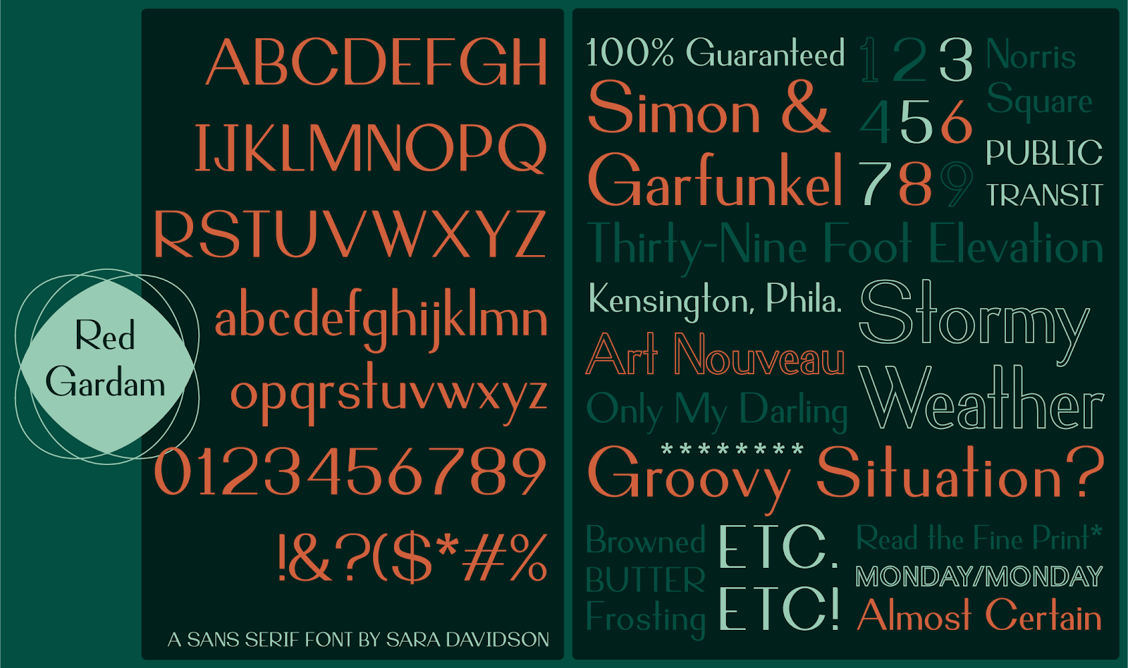
My process began by exploring the ‘Design a Digital Font from A to Z’ course from Domestika taught by Juanjo López. Through the course, I learned the Glyphs design program — a tool created specifically for type designers. To get the most out of this learning experience, I created a typeface inspired by an existing logo — a useful design challenge based on the recent trend of custom brand fonts. Below is the logo that became my starting point for a uniquely shaped sans serif typeface.
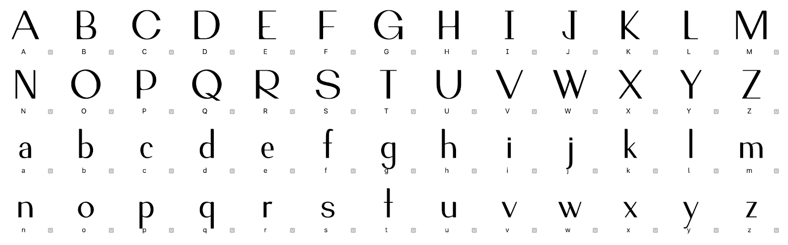
Once the logo’s letters were converted to shapes in Glyphs, I was able to build a system for all uppercase and lowercase letters, numerals, and symbols.
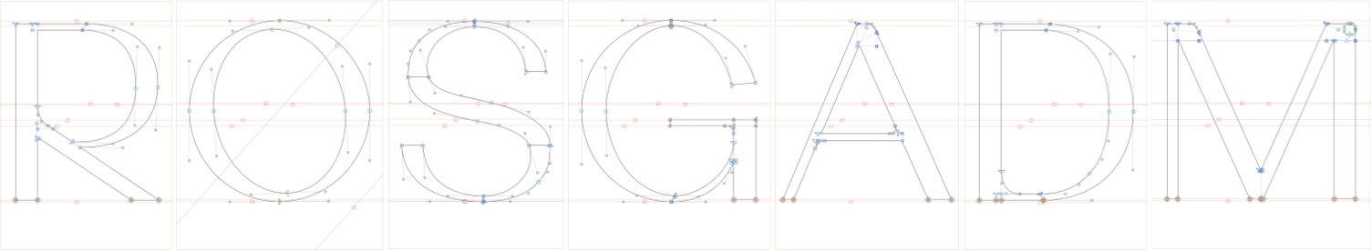
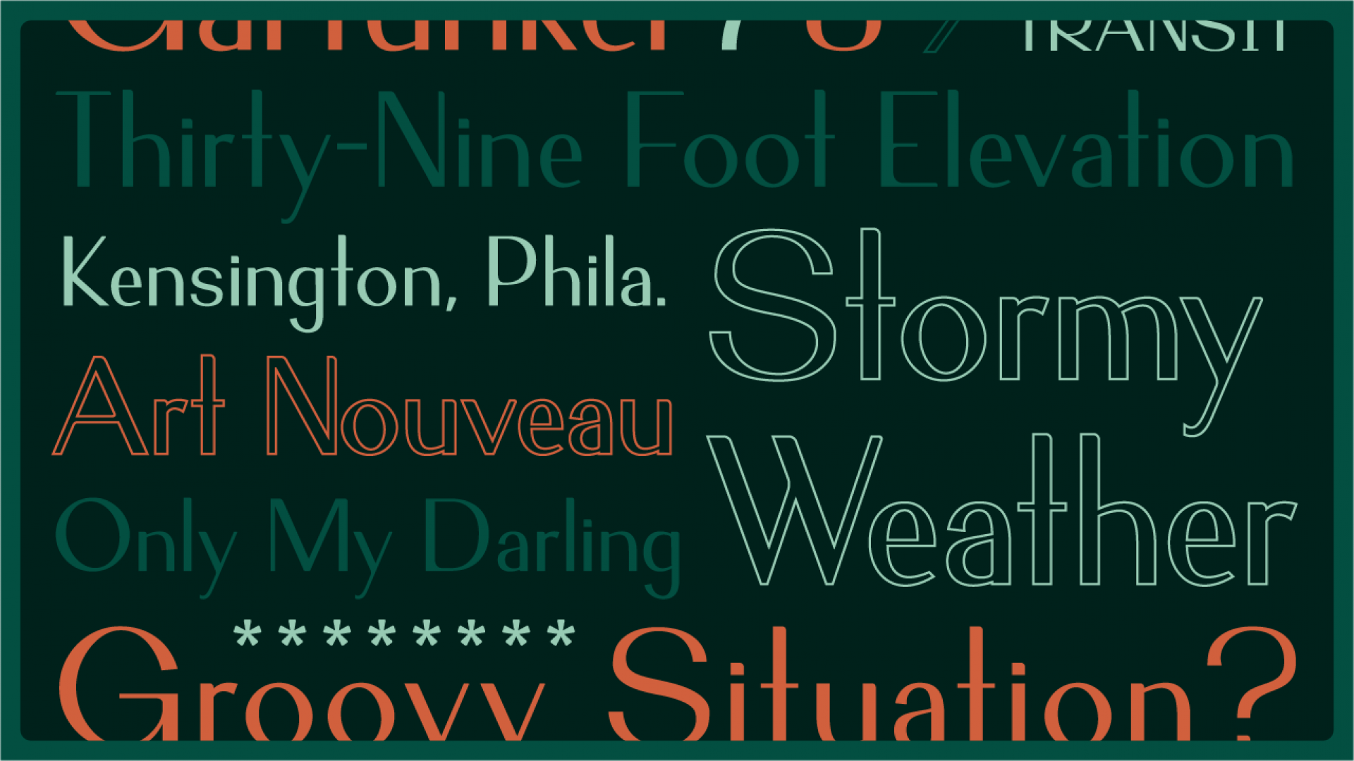
The resulting typeface was created by applying consistent proportions across each character, and establishing guidelines for the x-height, caps height, baseline, ascender height, and descender height. Close attention was also paid to character relationships — the similarities in shape, angle, and proportion of each item — ensuring a cohesive set of letters. After every character was created, the most important step was to establish standard character spacing and then adjust the kerning between each pair. Finally, the completed font file was exported for testing and usage in any design program.
After working my way through this process, I learned that designing a font is time-consuming, mathematical, and detailed. Like most new skills, it takes some practice but is ultimately rewarding. The most challenging part was deciding how to draw each character — how wide, how round, how angular, etc. — while still ensuring they were all cohesive together. This took some trial and error to develop a typeface with nicely balanced character relationships.
My main takeaway from this experience is that it reinforced the idea that every font in existence was designed with a specific purpose, use, or style in mind. Even fonts that we think of as default or basic took careful consideration and months of work. I've certainly gained a new level of respect for type designers through this process, although I don't think I will be joining their ranks any time soon.